

 Affordable tips and techniques for better quality photos
Many contests and shows require you to send in photographs of your project along with your application. But not everyone can afford to hire a photographer to take professional photos of their project. A poor-quality photograph can make an excellent project look poorly done.
To get a good photo of a project, you need to take several things into account. The most important four are image resolution, lighting, focus, and background. We’ve taken some excellent scrolled projects by experts in their field and photographed them properly—and poorly—to show how a few little tricks can really improve your photographs.
Resolution
Resolution is the most common problem we run into when someone submits a photo for publication. Resolution relates more to digital photography than to traditional prints or slides.
Resolution is measured in two ways— by the number of pixels, or dots of color, in an image, or by the actual size of an image and the number of dots per inch (DPI). For example, a photo downloaded from a standard web page may measure 5″ x 7″ on the screen, but may only be 72 DPI. In order to print something in a magazine, we need at least 300 DPI. When it is printed, a 72 DPI photo looks grainy and out of focus at 5″ x 7″. In order to get the resolution we need, the photo must be shrunk down to the size of a postage stamp.
 |
 |
|
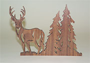
If your project is tall and thin, take a vertical photo. Both these photos are 5 x 7s, but the horizontal orientation sacrifices the size of the subject because much of the image is wasted on the background.
|
|
Most computers show the size of a photo in pixels. For most publications, your photo needs to be at least 1200 x 1500 pixels. For a 5″ x 7″ photo to be reproduced properly in the magazine, you need at least a 3 mega-pixel camera, but a 4 mega pixel to 5 mega pixel camera is preferred. While many people have camera phones, the resolution of these cameras is too low to reproduce in the magazine.
If you do use a 3 mega pixel camera, do not use the camera’s zoom function. Just get closer to the project. Without getting into the technical details, the zoom function on these cameras will usually give you a lower-resolution image.
When you have a digital camera, look up how to shoot the highest quality photos. You will not be able to store as many photos on your memory card, but we need to have large files in order to reproduce them in the magazine. TIFF files should be close to 5 megabytes in size, and JPEGs should be about 1 megabyte—at the minimum!
Also take the orientation of the photo into account. If you have a short, wide project, take a horizontal photo. If your project is long and thin, take a vertical photo. You want to try to fill as much of your view finder with the project as possible, and still get the entire project in.
Most cameras convert the photos to JPEG format (.jpg). JPEG files are a standard file that most computers can read. At Scroll Saw Workshop, we can also read TIFF (.tif) and Kodak files (.dcs). Unfortunately, bitmap (.bmp) and EPS (.eps) files usually will not work on our system.
| 72 dpi | 300 dpi | ||||
| Image | Size | File Size | Image | Size | File Size |
| 4 x 5 | 288 x 360 | 303.8k | 4 x 5 | 1200 x 1500 | 5.15M |
| 5 x 7 | 360 x 504 | 531.6k | 5 x 7 | 1500 x 2100 | 9.01M |
| 8 x 10 | 576 x 720 | 1.19M | 8 x 10 | 2400 x 3000 | 20.6M |
| The chart above shows how different sized photos convert to pixels. All measurements based on RGB file in TIFF format. | |||||
Lighting
 |
|
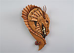
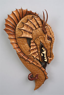
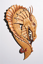
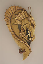
| A good photo of a Lora S. Irish intarsia design scrolled by Sam Willcox. The balance of shadow and highlight shows off the details of the project. Note the softness of the outer shadows that are cast by the piece. | |
 |
 |
| Digital cameras have a “white balance” setting in place to compensate for different lighting conditions. If you choose the wrong setting, the photos will take on an odd color. | |
One lighting concern is the white balance of the photograph. Natural light, incandescent light, and florescent light each takes on a different color. Incandescent light tends to be orange-toned, florescent light tends to have a green tone, and natural light has a blue tone. If using a film camera, there isn’t much you can do, but most modern digital cameras have a white balance adjustment that will compensate for the lighting.
If something is lighted poorly, the project either looks one-dimensional and flat, or the shadows obscure the project’s details. With computer software, we can sometimes lighten an image up, but this often degrades the image.
It doesn’t take professional-grade equipment to do an acceptable job of photographing a project. Scrolled works look best if lighted with two equal lights. Most scrolled work is designed to hang on a wall or sit fl at, so it is important to highlight the details equally. The lights should be the same wattage, the same distance from the piece, and angled at the piece the same way. This will show all the details of the project.
Pick up a couple adjustable desk lamps at a home improvement store, and fit both with the largest bulb they can handle (usually between 60-75 watts).
Suspend a white sheet or piece of cheesecloth 6-8″ in front of the lights to soften the glow, and you are set. If you use incandescent bulbs, be sure to adjust the white balance of your camera to compensate for the color of the lights—otherwise your project will come out looking orange. A better solution is to fit the lamps with two of the spiral florescent bulbs that have a traditional, screw-type base. These bulbs give off light that is much closer to natural sunlight, and make it easier for you to photograph the scrolled work.
 |
|
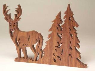
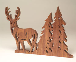
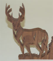
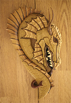
A slight change of angle adds great visual appeal to this deer fretwork project, a Lora S. Irish design, scrolled by Dave Penman.
|
 |
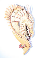
| Here the project was shot from the front with only the on-board flash. The details are washed out and the project looks very flat, and not that interesting. Note the harsh, close shadow created by the flash. |
 Poor focus will render a photo useless regardless of high resolution and good lighting. An image that is out of focus cannot be digitally corrected. Poor focus will render a photo useless regardless of high resolution and good lighting. An image that is out of focus cannot be digitally corrected. |
Position the lights to the left and the right of the camera (as shown in the illustration). Aim them so they illuminate all of the project, but cast no harsh shadows. If you are not careful, you will get a harsh shadow on both sides of your project, but careful positioning will eliminate the harsh shadows.
DO NOT eliminate the shadows on both sides of the project. Leave one subtle shadow on one side of the project. If you eliminate all the shadows, the project will appear out of focus.
It sometimes helps to shift the pose of the project to highlight details, instead of shooting the photo straight on.
The last lighting concern is glare. The usual culprit for producing excessive glare is the camera’s own on-board flash. Many projects have a glossy finish—and if the finish is glossy enough to refl ect ordinary light, then the bright light of a flash will appear as a glare to the camera.
Override the camera’s flash unit when shooting any glossy subject. If you are not using a flash and glare is still a problem, change the angle of your lights or the subject itself, as it is most likely reflecting light directly into the camera lens. You may also need to move the lights further away from the project.
Focus
Most people have what are called “point and click” cameras with an auto focus feature. No one wants to fiddle around with a lens to try to get something into focus. But auto focus cameras tend to pick one spot on the piece and focus on that specific part throwing the rest of the project out of focus.
For the most part, cameras have difficulty focusing on a subject when you are very close to it, or using the zoom function too much. If pulling back a little bit doesn’t help the camera focus on the entire subject, hold a $1 bill in the center of the project—where you want the camera to focus—until the camera’s auto focus locks in. Remove the bill and snap the photo.
 |
 |
 |
| Too much light and slight overexposure can “blow out” the highlights of a photo. | The glare off the glossy finish of this project is distracting and hides the details. |
Too little light makes the photo appear flat. |
Background
 |
| A busy background or one of similar texture and tone can totally upstage the subject of a photograph. |
 Not only can textures and color be distracting, but countertops, cupboards and furnishings can draw attention away from the project. This photo also suffers from the glare created by the camera’s onboard flash unit. Not only can textures and color be distracting, but countertops, cupboards and furnishings can draw attention away from the project. This photo also suffers from the glare created by the camera’s onboard flash unit. |
A good background for a photo doesn’t draw the eye away from the project.
The project should be the focal point of the photograph. The texture and lighting should focus on the scrolled work. That is why it is important to think about what is behind your project when taking a photo.
A good background makes the project stand out. That means, for a light project, choose a dark background. A dark project shows up best against a light background. Try to pick a plain background. Poster board, a bed sheet, a canvas drop cloth, or some sort of fabric all work well. If you are using fabric, be sure it is clean and free of folds, wrinkles and lint. A roll of photo background paper is your best bet and can be picked up at a photo supply store. Make sure paper backdrops do not have tears or creases. Avoid putting the project on a piece of carpet—the camera will pick up any color variation in the carpet and the carpet’s weave will distract the eye. Besides, it will look like you just placed your artwork on the floor.
Most scrolled work is small enough to move around, but delicate fretwork (such as a large clock) or large intarsia can be difficult to move. In these cases, you need to be even more aware of your background. Detailed wood grain patterns, such as wall paneling, are distracting and pull the emphasis off the scrolled project.
If you want to photograph your project in the shop, try throwing some cloth over your extra tools or move the project to the least busy part.
Whatever you choose as a background for your project, make sure the project is far enough away that your lights don’t cast a shadow onto the background. This shadow can be as distracting as a textured background—especially to fretwork pieces with heavy detailing.
Above all, think about where you are going to photograph your work. Resist using the sofa or kitchen table as a photo studio. If you have room to scroll, you have room to shoot.
 Tip: Plywood Photo Studio
Crosscut a sheet of 3/4″ plywood into two 4′ x 4′ sections and join them with three utility hinges along one edge. Set it up on sawhorses and open it up to rest one half against a wall. You now have a portable photo stage that folds flat when not in use, but provides sturdy support for backdrops and projects when needed. You can cut handles into the plywood to make it easier to carry.
When not in use as a photo studio, you can use it to store and protect flat items like drawings, plans and blueprints– or use it as workspace for gluing, assembling and painting or finishing your projects.
Tip: Background Material
A terrific photographic backdrop for small scrolled projects is a good sized sheet of matte laminate used for making countertops. It will flex to create a stage and background, cleans up easily, and will never crease or tear. Although laminate comes in hundreds of colors, it is best to use neutral shades. It is available at most home centers in limited colors, or can be custom ordered.